Improving efficiency through consistency, one design pattern at a time


“Every now and then, you stumble across a solution for one product that makes you pause and think: ‘Wait, haven’t I seen this problem somewhere else?'”
As UCD (User Centred Design) practitioners, we talk a lot about consistency. We talk about design systems, reusable components, and shared standards. But in the day-to-day delivery across large programmes of work – like the Department for Education’s (DfE) Regional Services Division (RSD) – it’s easy to get tunnel vision. You focus on your specific service, your specific sprint and your specific user need.
Every now and then, you stumble across a solution for one product that makes you pause and think: “Wait, haven’t I seen this problem somewhere else?”.
Here’s a story about how solving a case tracking problem in one product turned into a navigation pattern for an entirely different product and why spotting these crossover opportunities matters for users, teams, and budgets.
The original problem: Manage school improvement (MSI)
In MSI, users needed a way to track individual schools through various stages of intervention. When we looked at how people were working, we found a few familiar pain points:
- There wasn’t a quick way to see what stage a school was at.
- The existing PowerBI report was hidden away and not user friendly.
- Filters helped find specific schools, but didn’t show the summary progress information users actually needed.
Because of this, users started doing what users always do when tools fall short: creating their own manual tracker documents.
Case management spilling into unofficial spreadsheets isn’t unusual. Most project teams have identified this kind of need before, lined it up against other priorities and ultimately deprioritised it. Anything touching on “custom, bespoke views” usually requires significant developer resources and is expensive to build from scratch.
Viewing the problem with a different lens
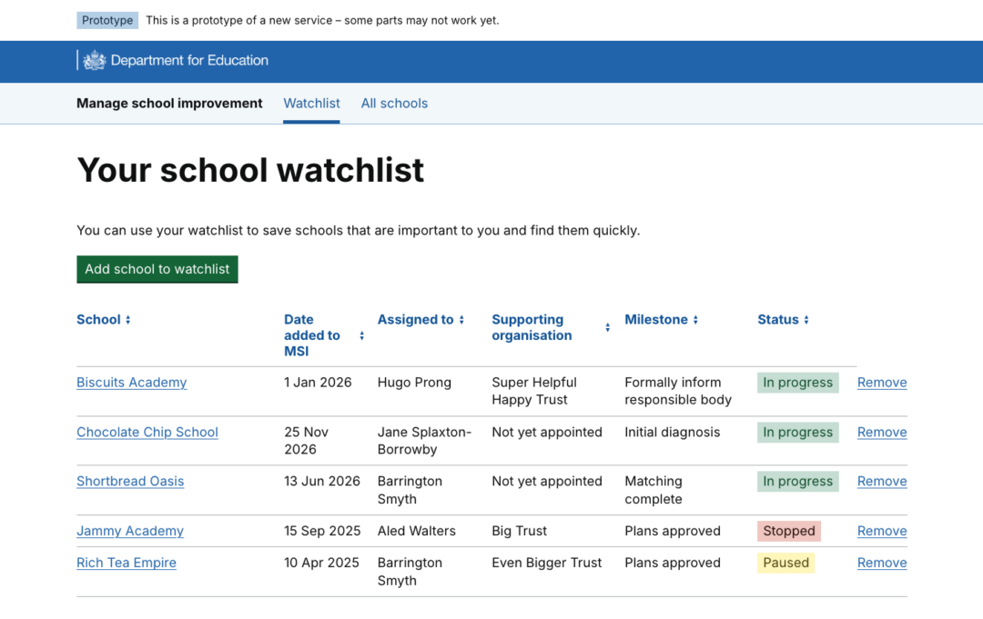
We decided to reframe the problem. Users didn’t actually want a complex, customisable table where they could construct bespoke columns and move data around like a spreadsheet. They just wanted quick access and navigation. They needed a top-level view of their specific schools, like when it was added, where it was in the process and what its current status is. This then allows them to do tasks like prioritisation for the day or creating quick updates for managers. More often than not, tracker documents become golden nuggets full of this information, especially helpful when a colleague goes on holiday, or unplanned leave.
Since the data points already existed elsewhere in MSI, we translated them into table columns and created a simple journey to pull schools out of the main “bucket” and display them in the table. We already had an autocomplete search function in the product, so we reused it to create an “Add to watchlist” journey.
Before we knew it, we had an MVP of a tracker tool, without ever touching the dreaded “custom views” territory.
Job done, move on to the next feature. Except…
Seeing the pattern elsewhere: FAST
Fast forward to a new team and a fresh perspective on another product: Find information about schools and trusts (FAST).
FAST replaced legacy software 3 years ago and has been thriving ever since. But one feature from the old system had never made the jump: the ability to “pin” or “favourite” establishments.
Looking back at research from 3 years ago, users were saying things like:
- “It’s really super helpful to just sort of go straight to it without having to search for it.”
- “I pin the ones I work with all the time.”
- “The ability to actually pin and unpin and just remove some things that aren’t relevant… I very much see the importance of that.”
For these users, sifting through hundreds of schools was a daily distraction, but searching for the same 10 establishments from scratch every day was equally slow.
When teams originally heard this feedback, the “bespoke reporting” goggles were on: “Users want to build custom export tables with any data point ever!” But stripped of the noise, the user need was identical to MSI: quick access to a saved set of records.
Reusing, refining, and delivering fast
Because our team had previously worked on MSI, we knew the Watchlist pattern inside out, from its initial design through to how it was built in code.
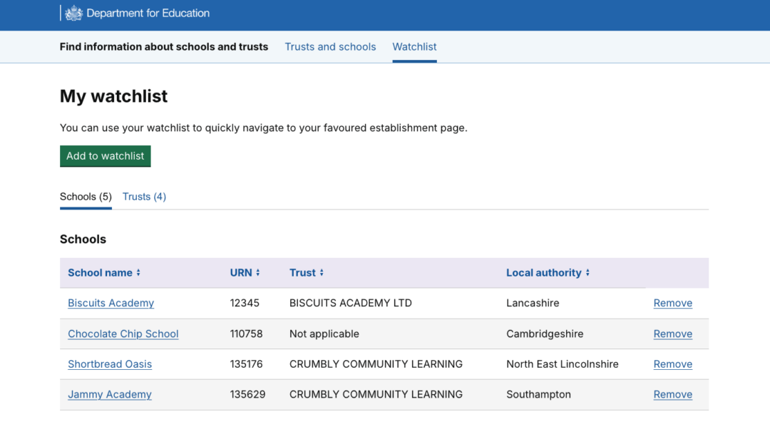
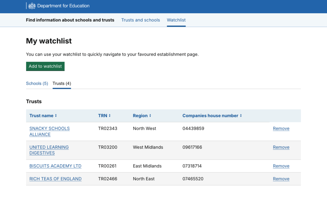
Instead of starting from scratch, we translated the solution directly over to FAST. We ran co-design sessions with Subject Matter Experts (SMEs) to figure out which table headings mattered most to them, again using data points already surfaced within the product.. Their verdict? Less is more. They didn’t want heavy data reports, they wanted a lean tool purely for quick navigation, split neatly into tabs for “Schools” and “Trusts”.
Because we were adapting a proven pattern rather than inventing a new UI mechanism, we went from reviewing legacy research to testing a working prototype in a matter of weeks.
This only happened because:
- The previous team left behind well-organised research.
- We kept strong relationships with engaged user groups rather than leaving them behind when priorities pivoted.
- We spotted the cross-product pattern early.
What’s next?
We’re currently gathering feedback from FAST users to see how well these minor layout tweaks perform in the wild. Once validated, we’ll roll those same UI refinements back into MSI.
Now that we’ve proven this concept across 2 separate products in the RSD programme, we’re formalising the Watchlist as an official pattern in our programme pattern library. Simultaneously, our tech team is templating the code behind it.
The goal is to make patterns like the Watchlist “off-the-shelf” solutions for the programme. Solutions that are ready to meet a range of similar user needs with minimal tweaking required.
Working this way introduces consistency by default. The user experience across our suite of tools becomes more intuitive for colleagues who work between systems, while technical consistency makes features faster to build and easier to maintain.
Happy teams, happy users, and, with a serious amount of time and resource saved, happy stakeholders.