Our first 30 days of technical performance analysis work at the Department for Education

We’ve helped the Department for Education increase the number, speed and results of data quality checks.
dxw has been working closely with the Department for Education (DfE) since it started work to modernise the process for schools applying to become academies.
We started a project with the Performance and Service Support team (PASS), who support product teams developing the new digital services. One of the assets managed by the performance analyst function in this team is a suite of data quality reports.
To assure themselves of the quality of information recorded in new services, the teams use Power BI dashboards to show the results of over 30 data quality checks. Good record keeping is important both for case workers and other areas of the organisation which rely on information for downstream processes such as funding decisions and school payments.
As the programme matured, the data quality reports built earlier on, needed iterations to be able to scale and run more checks in quicker time. The look and feel of the reports also needed refining to make them more usable for product teams and senior leaders.
Improving speed
In the first 30 days of starting work, together we added 18 new data quality checks, reduced the lines of code in the data source by 14% and improved the run-time by 7 seconds.
The knock-on impact of this work was a quicker, more reliable and useful set of reports for colleagues in product teams and senior leadership. Ultimately, it has led to faster and more effective downstream service delivery.
As part of the improvements, we also reviewed the ‘front end’ of the Power BI reports–the actual look and feel of the reports that product and senior leadership interacted with.
Improving usability
As well as the efficiency improvements discussed above, we modified the Data Quality Scorecard report to make it clearer and more usable.
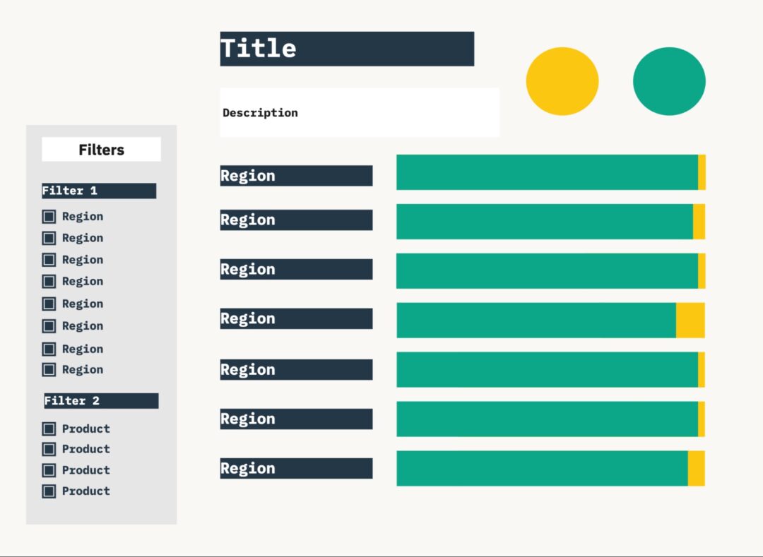
- Making it easier to compare figures: Originally, the % pass rate, number of checks performed, and the number of issues found were available on different pages of the report. This made sense when there were less checks, but user feedback told us that it would be good to have them on one page so it would be easier to compare.
We combined the information into one stacked bar chart with data labels to show the three key pieces of information. Each bar, representing each region, now has a label with this format:
98% (98 of 100 checks passed)
- Giving summary information: We also added summary circles at the top of the report to give an overall headline of the pass rate across regions. This would help those who only needed to scan for high-level information
- Adding filtering functionality: We anticipated that combining more information into one page could make it more difficult to isolate certain dimensions, so we added filters to the report. Users can now filter by:
- Region: Users can filter out other regions and show only their results
- Product: Users can filter to isolate data quality checks being performed on fields in a specific digital service
Improved use of colour: We also looked at how colour was used. Originally, colour gradients reflected the variation in pass rates. We learnt that this wasn’t necessary and instead moved to using colours to represent just two states: pass and fail. This makes things less ambiguous for the user who often wanted a quick indicator.
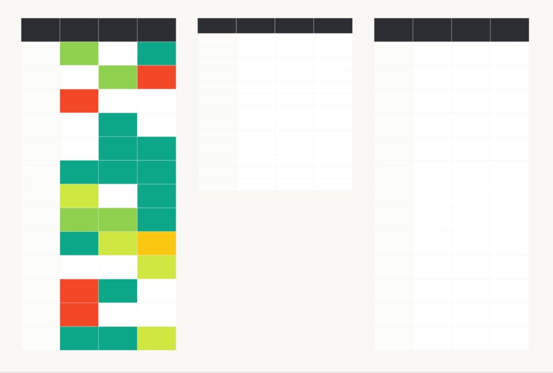
In the end we took something like this…
To something like this…
Improving accessibility
Within the boundaries of Power BI, we made sure the data was accessible through:
- Headings: Headings are very important signposts to those using screen-reading assistance. We reviewed the heading types used and made such that the three tiers of headings we used were consistent and logical.
- Descriptions: Although we are used to looking at graphs, we know they can be difficult for some users to understand. We made sure all new graphs have very clear descriptions with simple language.
- Colours: Moving from using a colour scale to two colours improved the accessibility of the charts. To represent pass/fail we chose to use Red/Green colour pairings. Despite these typically being difficult for those with colourblindness, they are commonly understood by users. To mitigate this, we used Red/Green colours that were highly contrasted enough and therefore could be used with greyscale overlays.
- Labels: For those who are not able to use colour to distinguish between pass/fail, we made sure that there were data labels on all visualisation.
- Tooltips: While tooltips are useful for those who are able to access them, we know they are not accessible for anyone not able to use a mouse. We made sure that any information in the tooltips were also in the report and therefore those that can’t use them aren’t losing out.
Improving manageability
While we were originally focused on improving the efficiency of the source code for the Data Quality Scorecard report, we decided that using a medallion architecture method would mean we could use the same codebase for the Data Quality Individual Issues report.
Not only did this make the views neater and more understandable for any new people who might be working on it, but it also reduced the likelihood of any issues in managing the two reports. Having this central source would be especially important as the team grew and more people were involved in managing the reports.
The changes also meant that the views could be used for multiple other purposes depending on the level of detail a user needed.
Next steps
In the spirit of Agile best practice, these reports are already being used to help inform iterations to products. Recent changes have been to increase the number of automated fields and add additional validations.
It’s work that can be reused across other services in the Department for Education and other organisations with similar digital services.
To speak to us about similar work that you’re exploring, email us at contact@dxw.com.