NHS England image reading: 2 weeks inside Breast Screening reporting
Reporting isn’t just about numbers. It’s about trust, accountability and professional reflection
Over 2 weeks, the dxw team at NHS England immersed ourselves in one very specific and complex topic: how image reader performance is monitored and reported in breast screening. This is central to patient safety and quality assurance.
When someone attends a breast screening appointment, their images (once called films) are taken by a mammographer and then reviewed by 2 image readers, usually radiologists. Each reader decides whether the result is normal or the person needs to be recalled for further assessment. If the 2 readers disagree, the case may go to arbitration for a third opinion.
Behind that clinical decision-making sits a lot of data. Image readers are required to reflect on their performance at least annually. Screening unit directors review performance. A central quality assurance team — the Screening Quality Assurance Service (SQAS) — oversees performance across units. And much of this monitoring relies on reports from the legacy system, Breast Screening Information Service (BSIS).
Our sprint focused on this reporting ecosystem: what exists, what’s painful, and what a better future could look like.
Week 1: Learning fast and making sense of It
We started by reading everything we could get our hands on including guidance for image reading, audit documentation and existing reports. It was a day of absorbing information and realising just how much context sits behind what initially seems like “just reporting”.
On day 2, we met with subject matter experts, radiology and screening leaders who live and breathe this work. Those conversations were invaluable. There’s something about sitting in a room with people who deeply understand the system that accelerates your learning curve dramatically. By the end of the day we had pages of notes, slightly sore brains, and a much clearer picture of the tensions in the current setup.
Reporting isn’t just about numbers. It’s about trust, accountability and professional reflection. Image readers need data that feels fair and clinically meaningful whilst Unit directors need oversight. SQAS needs consistency and comparability. And the programme needs confidence in the whole system.
From listening to building
By day 3, we shifted from listening to building.
I took on designing a data model for image reading which is something I hadn’t done solo before. Starting from an existing appointments model, I mapped the journey from appointment to image capture to reading, arbitration and outcome. The aim wasn’t to make it perfect. It was to ensure that if we wanted to report on performance properly, the underlying structure could support it.
Alongside that, we began mapping key performance indicators across user groups:
- What do individual readers care about?
- What does a screening director need to see regularly?
- What matters to SQAS?
- Where do those needs overlap — and where are they genuinely different?
That overlap turned out to be crucial. If we could design shared reporting views that met multiple needs, we could avoid building fragmented, duplicated solutions.
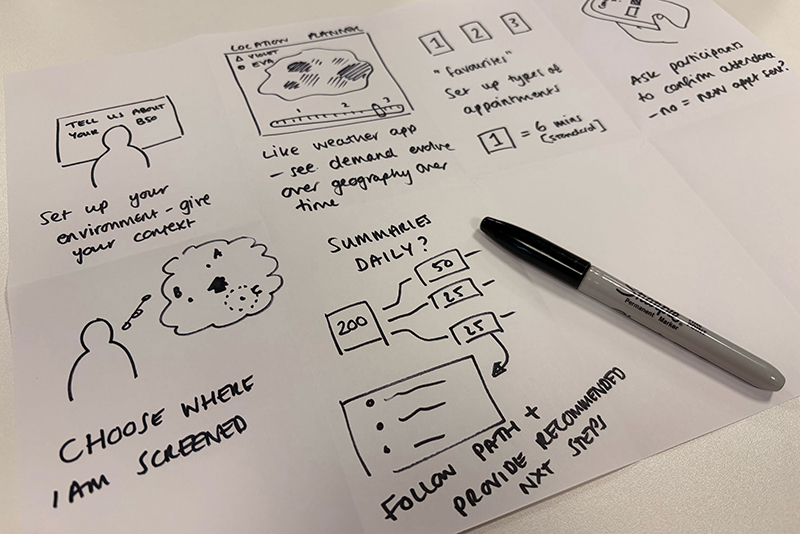
By the end of week one, we had early versions of a data model, a KPI matrix, and some rough reporting concepts. We played these back to stakeholders and got practical, specific feedback.
Week 2: Where things get real
Week 2 moved us from thinking to testing. One of the biggest questions wasn’t actually about metrics, but about location. Where should these reports live?
The current legacy system requires a separate login and isn’t very user-friendly. Image readers will likely spend most of their time in the new digital service being built so it makes sense for reporting to live there.
But SQAS isn’t likely to use this new service for day-to-day work. So do we build 2 front ends? Do we integrate somewhere else? Is that efficient? Suddenly this wasn’t just a design question, it was architectural.
To test feasibility, our data scientist built a small Streamlit app in Python in just 2 days. It handled the complex charts we were worried about. More importantly, it validated that the data model we’d designed could support those outputs.
At the same time, our service and interaction designer was mocking up report concepts and testing them with SMEs.
Reflections
Working in this way – intensely focused on a single topic for 2 weeks – was incredibly effective for learning. I now understand image reading and its quality assurance landscape at a depth that would have taken months in a more traditional rhythm.
The pre-reading helped align us and having SME sessions early gave us direction without boxing us in. Pairing across disciplines, design, data science and service design made everything stronger.
The sprint delivered something important: a validated data foundation, clearer thinking about KPI reporting, tested visual concepts, and a sharper understanding of platform constraints.
Most importantly, it reinforced that reporting in breast screening isn’t administrative back-office work. It underpins clinical quality, professional reflection and patient safety. Getting it right matters.