Accountability Hack 2014 – A closer look at the data we used

Last weekend dxw entered a team into the Accountability Hack run jointly by the National Audit Office, The Office for National Statistics and Parliament. Our hack – Right to Buy-Bye ended up winning both the ONS category and the Best in Show prize.
We’ve already blogged about the process of building the hack, so in this post I thought it would be interesting to take a closer look at the data we used and what we tried to infer from it. For each type of data we present I’ll explain where we got it from and how we’d improve the app in that area.
We’ll also discuss a bit about the data quality issues and what conclusions it is reasonable to draw at the end of the post.
Local Authorities
The first thing to (shamefully) admit is that since the DCLG datasets we used only covered England, Right to Buy Bye only includes English Local Authorities
How it could be better
A full list of England Local Authorities was present in all the datasets we used, but there doesn’t seem to be any universally agreed-on system of identifiers. DCLG use codes like F0114 (no obvious pattern), and ONS codes are like E06000022 (E06 for Unitary Authorities, E09 for London Boroughs etc.)
The DCLG data on Social Housing Sales contained both identifiers, allowing us to join up all our datasets.
What we learned from it
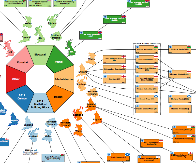
You’d think that the breakdown of the country into geographical regions would be fairly straightforward, but Sam Machin‘s excellent blog post on the topic shows a much more complicated picture:
How we’d improve the app
Obviously including all UK local authorities would be the first step. Showing data at different levels might be interesting: from region to county, perhaps even down to individual wards – though the data might cease to be meaningful at that level of detail.
We noticed later that we’d included a couple of Local Authorities which no longer exist (!) which would explain some of the “No data” readings.
Social Housing stock
The 2011 census gave us data on the total number of households in each Local Authority, and the proportion of social housing households. We used dataset QS405EW: Tenure – Households
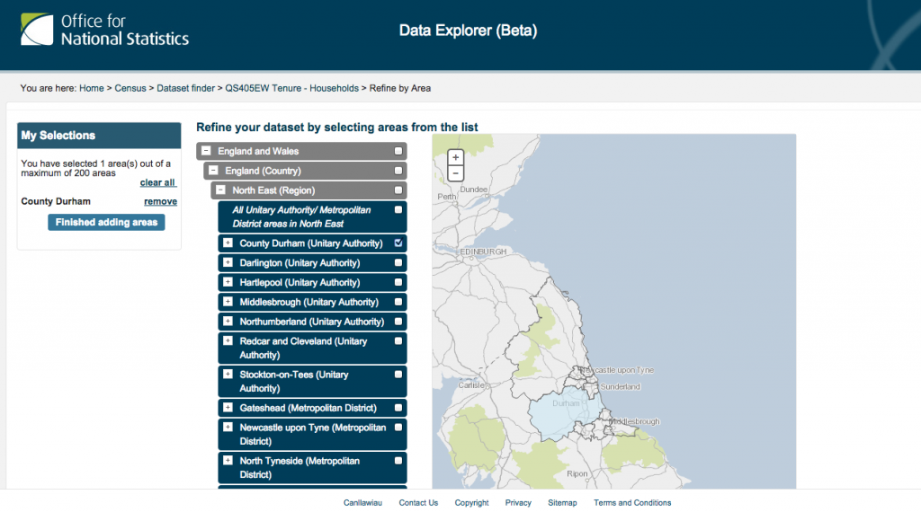
The ONS Dataset Finder was invaluable in identifying the datasets we needed, and the right level of detail for our purposes. Unfortunately it’s hidden away under ‘Products’ on the API homepage rather than the more obvious “Developer toolkit”.
How the data could be better
Census data is arranged by geography, which means that it’s easy to see data at different levels of detail – from Ward to Local Authority to County to Region – but the only way we were able to get data to compare between local authorities was to make one API call for each of them – that’s over 300 individual requests!
Although the data is rich and the API is potentially very powerful, if we’re honest we probably wouldn’t have been able to use it without the assistance of someone who knows it inside-out (thanks again to Sam Machin!)
What we learned from it
We might have misinterpreted the data, but it looks like on average around 15% of all housing in the UK is social housing – up to 35% in some Local Authorities (based on the 2011 census).
This includes both renting from councils and from other types of rental (presumably including private social rental). There’s usually a big difference in numbers between the two types – sometimes council is much larger, sometimes much smaller.
How we’d improve the app
From the census we can of course only get a snapshot at 10-year intervals of the social housing breakdown. We’d be surprised if this data isn’t tracked by the local authorities themselves on a smaller timescale, though it might not be consistent or open across the board.
Being able to use more current data, and to show trends over time would give a much richer understanding of the data.
Making a distinction between council rent and other social rental types might be interesting.
Homelessness
The Live tables on Homelessness page on gov.uk contains a bewildering array of spreadsheets from DCLG giving stats on homeless households including numbers in temporary accommodation and outcomes of homelessness prevention, with various breakdowns, including ethnicity and category of need. Some are national, others regional and some at Local Authority level.
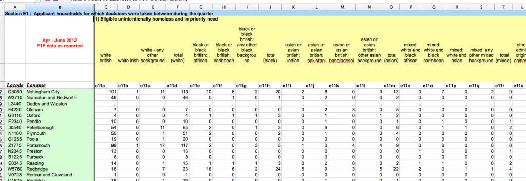
We settled on “Detailed local authority level homelessness figures: April to June 2012” which shows data for “Applicant households for which decisions were taken between during the quarter”
We totalled up the first 3 columns…
1) Eligible unintentionally homeless and in priority need
2) Eligible, homeless and in priority need but intentionally so
3) Eligible, homeless but not in priority need
…and excluded the others:
4) Eligible, but not homeless
5) Ineligible households
We didn’t have time to properly research what all the data meant, but we made a fairly hefty assumption that “applicant households” meant households which applied to the council as in need of housing, and that the first 3 columns might represent Homeless households who could potentially be placed in social housing.
What we learned from it
It was difficult to imagine what “homeless and in priority need but intentionally so” meant. An article from housing and homelessness charity Shelter sheds some light:
When deciding if you are or aren’t intentionally homeless, the council must consider the reasons you became homeless. It’s up to the council to prove that you became homeless intentionally and that:
- you knowingly did, or failed to do, something that caused you to leave your home
- the act, or failure to act, was deliberate or you were aware of what was going on
- you could have reasonably stayed in that accommodation
How the data could be better
The first thing to note is that all the data is in excel spreadsheets and designed to be read by humans and not machines (or if it does exist via an API we couldn’t find it). In order to use it in our hack we needed to manually clean it up and produce our own CSVs.
Given how many breakdowns of the data are presented in each spreadsheet, this data is crying out to be exposed in some queryable way.
Next, while it’s great that this data is shared publicly none of it comes with descriptions, so finding the right dataset and understanding what it all means isn’t at all easy.
Finally, the data we were interested in was missing from a number of Local Authorities.
How we’d improve the app
The data we found is probably not a full picture of numbers of homeless – e.g. it might only account for households who actually applied for assistance.
On the plus side it’s available quarterly back to the second quarter of 2012 so looking at how it’s changed over time would be interesting.
Also looking at some of the different ways in which cases are categorised might make for some interesting comparisons between Local Authorities.
Social Housing Sales
Data on Social Housing sales again came from DCLG ‘Live Tables’ on gov.uk
We used Table 648: annual social housing sales by local authority and chose the sales for 2011-12.
How the data could be better
This data was again in Excel spreadsheets and suffered from the same problems as the homelessness data – though it’s a little clearer what each sheet relates to and a useful description is provided at the bottom of the page.
Confusingly in the dataset we used, a significant proportion of the Local Authorities were marked as “not applicable” or “Local Authority owns no dwelling stock”, which didn’t seem to agree with our dataset on social renting.
What we learned from it
There’s a massive difference in numbers of sales between Local Authorities, with many having zero sales for the period with others selling hundreds or even thousands in one year.
How we’d improve the app
The figures we used are labelled as “Social housing sales”. The live tables also included “Right to Buy sales”, “Right to Acquire sales” and “Social HomeBuy” sales. It’s not clear if these are included in the “Social housing” figure or additional to it. It would take some additional research to identify which data allows for a meaningful comparison, and showing different types of sale might me interesting.
Looking at the data it was notable that Lambeth had sold off nearly twice as much housing as the next highest Local Authority. A quick google search threw up some blog posts and news articles about sell-offs which might be relevant.
Being able to annotate particular outlying values like this would be key to helping users to fully understand the story behind the numbers. This would be difficult to achieve automatically, but it would be fairly easy to highlight these outliers and suggest search results which might explain them.
Households in need of social housing
This was possibly the biggest stretch we made in presenting data: assuming that current households in social rentals + number of homelessness applications = number of households in need of social housing. This is almost certainly inaccurate, but we’re confident that some meaningful indicator of need could be calculated.
Conclusions
Although Right to Buy-Bye used entirely real data with nothing hard-coded (a first for me personally on a hack!) it’s only showing a single snapshot of the data at a particular point in time, and we had to be quite liberal in our assumptions. The app as it stands presents data which is possibly misleading, probably inaccurate and definitely out of date.
However, to focus on these failings would be to miss the point: hackathons aren’t about producing solutions which are fully working and correct – they’re about showing what stories you might be able to tell with the data, and what might be possible given some time, some money and some improvements to underlying data sources.
Overall I’m pretty proud of what we were able to achieve in 24 hours, zero budget and some pretty shaky data, and I certainly learned a lot in the process.