Our new brand: what we did, how we did it, and why we did it
We wanted something that would help to differentiate dxw. But what does that mean in practice?
We’ve grown a lot over the last couple of years, and it was time for our brand to catch up with us. We want our identity to represent who we are now.
Our mission and values remain, but the company has a different personality. We have more people and offer a much wider range of services and products. If we’re being honest, we also wanted to show-off our design credentials.
Structured critique to understand where we are now, what works and what doesn’t
In late 2018, we decided it was time to give dxw a fresh visual identity. The first thing we did was to run a day-long critique session. I printed huge montages of examples where people come into contact with our brand. Alongside these were similar montages of our contemporaries’ visual identities. Using structured critique, we analysed all the parts of our visual identity. Now we were able to articulate what worked or didn’t work, and why.
As the day went on, colleagues were able to drop in and out of the session. We also shared the findings company-wide to give everyone a chance to contribute.
Using an external supplier to help us understand ourselves better
For the design process to be objective, we needed reflection and challenge. We decided early on that to do this, we’d bring in an external partner to work with us.
I made a list of potential design partners, and Wendy, our Director of Marketing and Communications, and I worked through them. We weighed up their portfolios, their ethos, and their values. We then arrived at a selection of 3 potential partners and sent them our brief.
When the proposals came back, there was 1 in particular that excited us. We arranged to walk our Managing Director and Founder, Dave and Harry, through all 3, hoping that they’d see the same potential we saw. They did. The partner that resonated most with dxw and our values was Fieldwork.
I’d been aware of Fieldwork for some years and admired the distinct visual style of their work. This, along with their ethics, and the fact they weren’t “another London agency” excited us. We accepted their proposal and got down to work.
Discovery phase
Loz and Andy from Fieldwork held a half-day discovery workshop. We talked about our vision for dxw, our values, services and products. There was a review of the client interviews that Fieldwork carried out on our behalf. We also analysed our competitors, contemporaries, and their brands.
Moodboards and concept rounds
Fieldwork got under the skin of our brief and did some visual exploration. When we’d narrowed down a few parameters, they were able to start designing in earnest. We gave them a shortlist of our most often used pieces of branded material as assets to roll the designs out on.
We agreed early on that we’d work in small, iterative chunks, keeping the feedback loop as tight as possible.
Wendy, Loz from Fieldwork, and I had a private Slack channel where we’d discuss progress several times a day. This echoes the way we try to work on client projects and helps create a feeling of shared ownership. When we agreed on a concept, Loz would put it into a presentation document, and we’d share it for the wider company to see.
Approved concept
We arranged a session to walk our directors through the first round of concepts. I pinned the work on the walls, and we did some silent dot voting, leading to some good conversation.
We were able to articulate what worked and what didn’t across each idea. This we fed back to Loz as guidance for round 2.
During a video call when Loz was showing Wendy and I his sketches, we saw something that leapt out at us. We asked for some iterations, and there was a real buzz between the 3 of us about what was unfolding. With a few tweaks this became round 3 — our final and approved direction.
Creative rationale
We wanted something that would help to differentiate dxw. But what does that mean in practice?
Lots of businesses try to “own” a colour (dxw having been guilty of this too). So we asked ourselves — what if we didn’t have a main colour to identify us? If we have a palette where no colour has more significance than the next, how do we remain recognisable?
This only works if the other elements of our identity are strong enough to spark recognition. Our “D” marque is simple and bold, and gives consistency with any of the combinations from our palette.
Often a logo will consist of a marque (symbol) and a logotype (wording). There’s not usually too much between the 2 in size terms. We’ve decided to do something a bit different and have the marque be a very discreet component of our logo. It’s almost like a full stop. The marque in the logo can be any of our colours, as you can see when you navigate between the pages on this website.
Our choice of new typefaces was very deliberate. We wanted to move away from the ubiquity of sans serif fonts for everything. We tried a few combinations of serif and sans, settling on 2 fonts from Google — Poppins and Cardo. Poppins lends itself to headings and short, bold statements. Cardo is a beautiful, high-quality Old Style font that reads well in longer text.
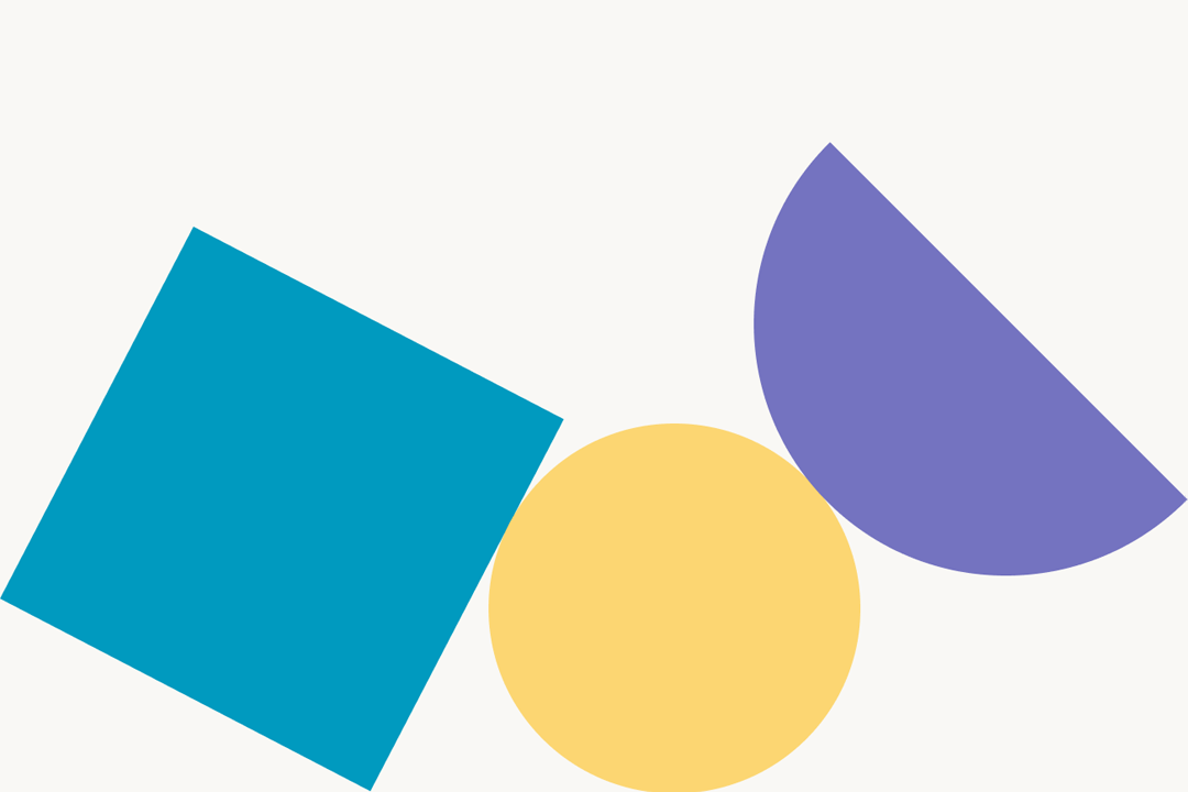
Finally, we needed a graphical device to add some visual interest, and this is where our shapes come in. They allow us to give some visual interest, break up pages, balance layouts, and add splashes of colour. We’ve got a light-touch set of rules for their application, so we can keep things consistent over time.
Toolkit and usage
Fieldwork got us set up on their brand toolkit application. It gives staff a place online to read guidance on usage for all the elements of the visual identity. They can also download any of the assets in a variety of sizes and colourways.
At the time of writing, we’re still making small tweaks to the toolkit and some of the assets. We learn more about the usability of our new identity with each new piece of collateral. By continuing to make these tweaks, the new brand should continue to reflect who we are in the coming years.