How to create interactive outputs using Figma (part 1)

Clear communication and patience across the team meant we were able to iron out the creases and deliver the assets needed
Working collaboratively is embedded in nearly everything we do. From working with our client delivery teams, on internal projects, and as part of cross community groups, there’s always an opportunity to collaborate and design together at dxw.
We recently worked with the Department for Levelling Up, Housing, and Communities (DLUHC) on a discovery project looking at the national planning system. We experimented with different ways of working and this blog post shares what we learned about creating interactive outputs using a tool like Figma.
What were we doing?
This was a complex project to produce a set of assets that could be used and shared across teams within DLUHC to highlight the existing overlaps, areas of potential risk and improvement in the planning system. We looked at the “as is” and “to be’”version of the planning system, and mapped out insights that we found through research sessions with users from various roles and responsibilities.
The assets we delivered were in both digital and print format. We considered multiple tools that we could use to design and build our assets, weighing up the benefits and drawbacks. The most important factor for our prototype was to be able to share it in an accessible format, which was one of the reasons we decided to build it using Figma.
What were the challenges we faced?
During the project we used different tools to document, refine, and share the insights we found from our research interviews. We came across a few bumps along the road, here’s how we dealt with them and what we learned.
Navigating and tracking control of changes was tough on a spreadsheet
Initially, one of our biggest challenges was navigating through all of the research insights. The team used a spreadsheet for these and it was continuously being added to and edited. We didn’t initially set out a standard way of tracking the changes that had been made and, with so much information, that became a problem.
We split the insights into separate tabs which meant we could easily navigate to the correct content for a specific page on the prototype we were building, and started by highlighting which cells were being edited. This was useful to begin with, however as we were populating the spreadsheet and the prototype in parallel, it was still easy to miss out things that had been changed.
This, together with the fact that we weren’t all experts in planning, and some team members joined at a later date so were starting with little knowledge of the research insights, meant good communication across the team was really important.
Adapting the design to make content a priority
We were constantly thinking about new features to add to our prototype, and how to improve the readability and content. We also had to think about both the print and digital versions, which influenced our design. It was challenging to prioritise the information we included, but as a team we explored ideas together.
We realised that in narrowing down and presenting all of the content, we kept tweaking box sizes on the prototype and this was was leading to inconsistencies across the designs. To avoid this in future, we’d recommend designing with the content first. In the end, we created a visually appealing prototype that included all the information we needed. But there was plenty of trial and error along the way.
As we developed the prototype, it got more difficult to interact with
Our design for the digital prototype was made up of ‘cards’. The cards were individual pages that linked to processes within the planning system.
Each page we were building linked to multiple other cards, which meant it soon became pretty daunting to look at in prototype mode. If we were to do this again, we would take a more gradual approach using a checklist. It became a monotonous and difficult task to link up the correct pages with so many links to check through.
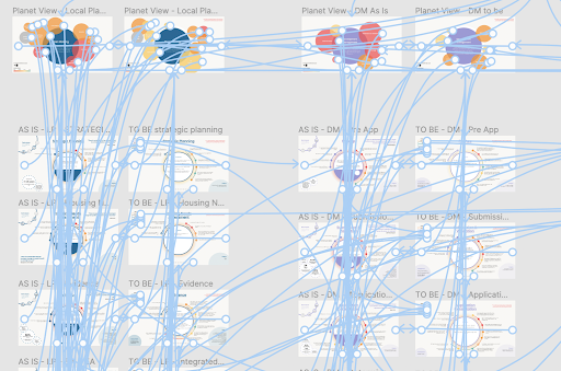
The image above shows how complex the board was near the end with hundreds of links going back and forth to different sections of the prototype.
Keeping on top of clearing the boards
We weren’t just designing one page, but designing and iterating fifty interactive cards. It took up a lot of space on Figma, as we were also duplicating pages just in case we missed anything out. We deleted all of the pages that we didn’t need and moved other elements to an additional board to reduce the amount of storage and frames on the board. This helped us to keep the board clean and make sure we were working on the right frames, at the right time.
In summary, this is what we learned:
- keep track of any changes and decisions in a way everyone on the team can access
- design with the content first
- use a checklist to keep on top of new features and content that has been added
- tidy up your work regularly
Clear communication and patience across the team meant we were able to iron out the creases and deliver the assets our client needed (we got great feedback). In the next post, I’ll go into more detail with some recommendations about how to set up a Figma board for collaboration with a delivery team.