How to set up a Figma board for team collaboration (part 2)
Setting up components and objects at the start which teams can easily access and edit, will save you time in the long run
Figma is an online collaborative design tool, which helps teams interact remotely. Multiple users can access a Figma board, and make changes to designs, which is super handy for multidisciplinary and collaborative teams. It also gives you control of who can access the board meaning you can add any team members you’d like.
Figma has a wide variety of design templates and plugins that can be shared and re-used, which makes it easy to copy frames from one project to another. This is especially useful when you’re using GOV.UK patterns and components.
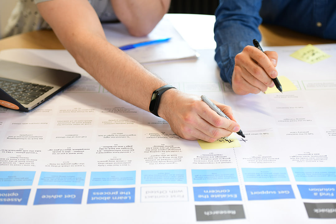
In our last post, we explained how we used Figma to create a digital prototype to map out the overlaps, risk, and improvements for the planning system. At dxw, we’ve used Figma to create other assets too, including branding, digital services for other clients, and for internal projects. In this post, we’re going to explain how to set up Figma to help a team collaborate on designs.
Step 1 – create a page for your project
First of all, start by setting up a page for your project. A page will contain all of the frames that you create and will store them together. You can create multiple pages, which contain different frames.
Frames are used to group together elements of a page, and help you to apply layouts and interactions from one page to another. We recommend creating pages with different design phases on the project. It’s also important to remember that there’s different types of pages:
Prototyping pages
This is a place to start building and iterating your designs. Prototyping is an experimental process where you can create low to high fidelity concepts to test with users. You can add additional pages to keep track of how your design changes during each sprint and name it accordingly (for example, “Iterated prototype – version 2 – sprint 2”). Creating new prototyping pages for different fidelity designs gives you the ability to keep track of your progress and the changes your team has made.
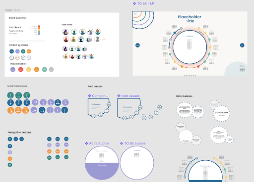
Components
Keep a separate page on Figma to build a component library. This is a place to store all of your components and design guidelines, and where you will go to pick up features that you may want to reuse across your prototypes.
Final page
This page is a place to keep your most up to date prototype that you’re finished with. This is useful when you need to go back to the project, to see where you ended up. It removes any clutter off the page, and should be the highest fidelity prototype for your project. It’s also a good idea to keep a log of iteration versions.
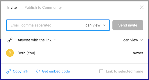
Step 2 -make sure everybody has access
Figma lets you share with other members of your team, allowing extra space for collaboration. Along with giving access, it helps you share your designs, prototype collaboratively, and sets restrictions on access levels. It’s quick and easy to change user access to the board. Making sure you have the right permissions will help the team access it from the start.
Step 3 – set up a component library
Components are reusable objects that can be reused across multiple designs and project pages. For example, components could be a simple button, a navigational menu, or a footer. Main components can be copied into a project and be edited and changed, which will be reflected across the designs.
Components are incredibly helpful and efficient when designing consistent webpages and styles. Components help us to keep designs consistent across multiple pages. They allow you to edit the content while maintaining consistency. Setting up components limits the risk of accidental changes being made to the layout, and reduces the amount of fiddly work and pixel pushing you can end up doing otherwise.
Setting up components and objects at the start which teams can easily access and edit, will save you time in the long run.
Read more about creating Figma components.
Step 4 – set up styles
Styles also help to create consistency across our designs. Styles focus on the visual styling of the component, like text and colour. Any changes that are made to the properties within a style will be reflected across all of the objects that use that style.
This is a really quick and easy way to maintain consistency across various objects.
Step 5 – create a prototype checklist
When we’re working collaboratively on a project, we often share tasks between each other, for example checking each other’s work for the things we may have missed.
We would recommend creating a checklist, with a date, to see all of the elements you have on your page, including typography, colour styles, and any interactions you want to check over.
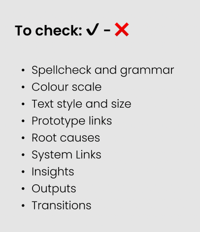
If you’re testing a lot of pages, it can be really easy to miss something out. Bringing in a checklist from the beginning is useful to keep an audit.
These are just a few tips based on our recent experience. We hope they help you when setting up Figma files for collaborative working in future.