Choosing a new typeface for the Hackney Council website

The entire process was content-focussed and user-centred
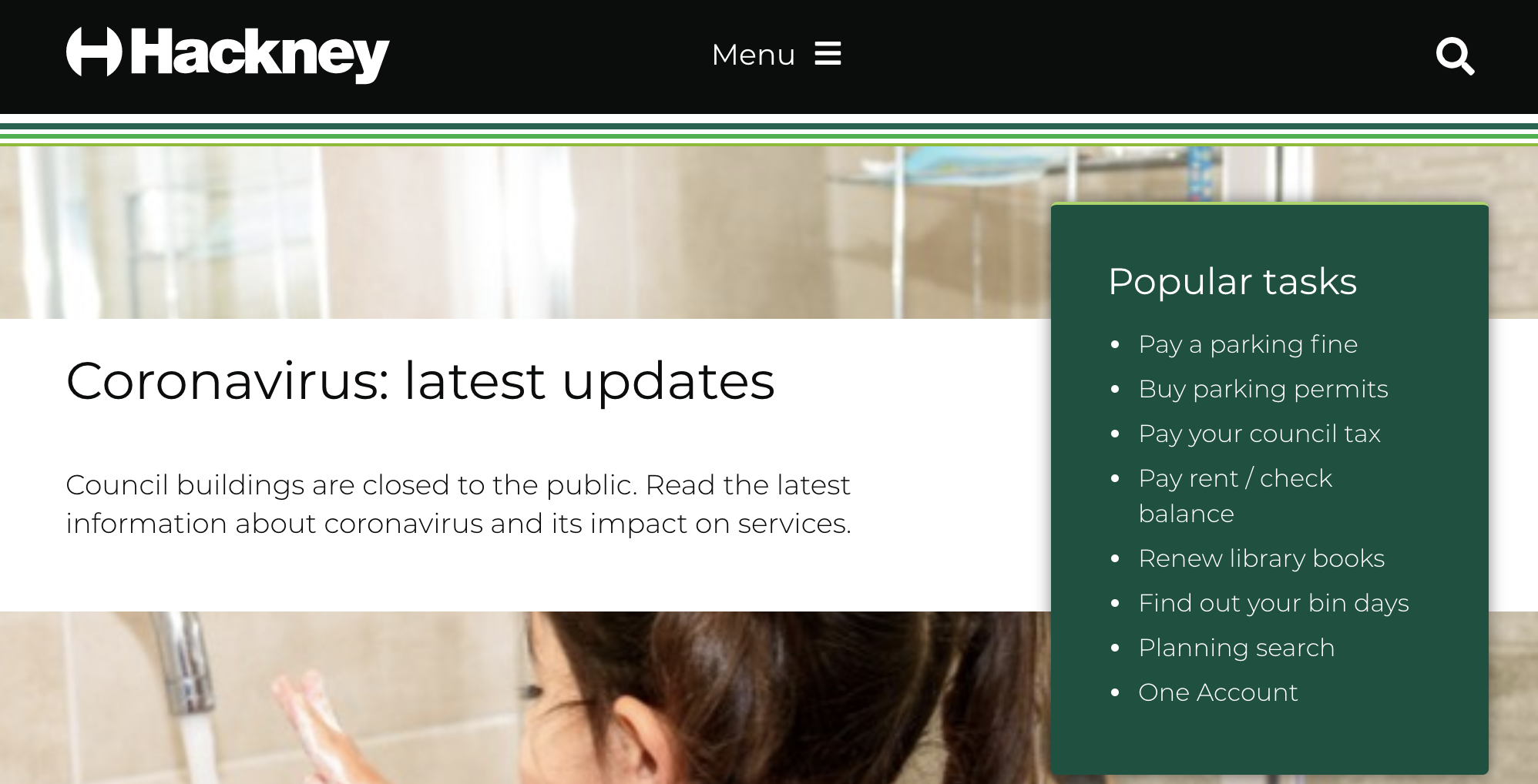
We recently worked with Hackney Council to improve the quality of typography on their website.
The council’s website has been using Montserrat from Google Fonts as the main typeface, but the team had received complaints about legibility. They asked us to help improve things.
Problems with the typeface
After some initial analysis of the issue, we identified 3 main problems:
- the font weight on the website was too light to be accessible
- Montserrat characters were too wide to be used for paragraphs of body text
- the style of Montserrat didn’t match with the content
Our approach
In typography, there are many aspects that can improve legibility and readability. However, Hackney had asked us to find a quick fix, so we designed a 2 day content-first approach. Typography is never a task of just choosing a typeface – it’s a process that we have to test with users so we have a better chance of making the right decision.
As the designer on the project, I was responsible for selecting a new and appropriate typeface, and then applying it to the Hackney Council website. Making sure the entire process was content-focussed and user-centred.
The project team had 4 members, including me as a visual designer, a project manager from dxw, and a service designer and front-end developer from Hackney. We worked together on various steps of the process, from new typeface selection and prototype evaluation to the actual implementation.
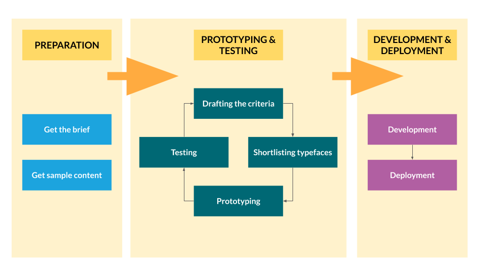
We broke down the process into 3 parts:
- preparation
- prototyping and testing
- development and deployment
Preparation – day zero
Before choosing the typeface and website development process, there was some preparation to be done. First we had to get the brief sorted out and then get a sample of website content.
The brief
We asked the client some questions to help us form a website brief for the project. We asked questions like:
- What’s the goal of the website?
- What’s the typical length of an article: short/medium/long?
- Is the content for users to scan or look for something in particular?
Once we got answers to our questions, the brief looked like this:
- the website provides information to the public and is for transactions like payments and subscriptions to the council
- articles are usually a 3 to 4 minute read
- content is mainly information about council services, cultural information, and things to do
- the website needs to load quickly
- the typeface must meet standard accessibility guidelines
- it must be easy to read on digital devices and accessible for mobile, laptops, and computer monitors
- the typeface must be legible at different sizes
Sample content
Besides getting a website brief, we also asked Hackney to provide a few pages of content for prototyping and testing. Taking a content-first approach, means we don’t design without content and we try to avoid using “lorem ipsum” type text. If there’s no existing content, then it’s better to find similar content elsewhere. Luckily, the content for our project was on the live site already. Hackney suggested using the homepage, search results page, and 3 other content pages for prototyping and testing.
Prototyping and testing – day 1
We were then able to start the work. At this stage, we went through the following process:
- drafting the typeface selection criteria
- shortlisting typefaces
- prototyping
- testing
It looks like a typical design thinking process, right? Although it was a small project, this was still the right way to meet the project brief.
Drafting the typeface selection criteria
The brief is essential because our typeface shortlisting criteria is based on the interpretation of it. The criteria for the new typeface looked something like this:
- sans serif typeface
the Hackney Council website is providing a modern and up-to-date style of information - large x-height
An easy to read typeface is more important than anything for this project - low-to-regular stroke contrast
A typeface with weaker stroke contrast usually has better legibility - bold style
Some of the current content has been using bold style for emphasis so the new typeface has to provide bold style too. It sounds like a common function for all typefaces, but there are typefaces on the web that don’t have a bold style by default - opentype features are not necessary
Advanced features like small capitals and stylistic alternatives are not needed for this project. A typeface without Opentype features can save some loading time because of the smaller file size - 2-3 font weights
A single typeface with multiple font weights will be good for loading. A limited number of font weights will also help in maintaining consistency in style - preferably a free font
Budget is available for this project but if a good free option is available then that will be even better
Shortlisting typefaces
With the above selection criteria, we visited websites of some of the webfont providers to look for suitable candidates including:
- Google Fonts
- Fonts.com
- Adobe TypeKit
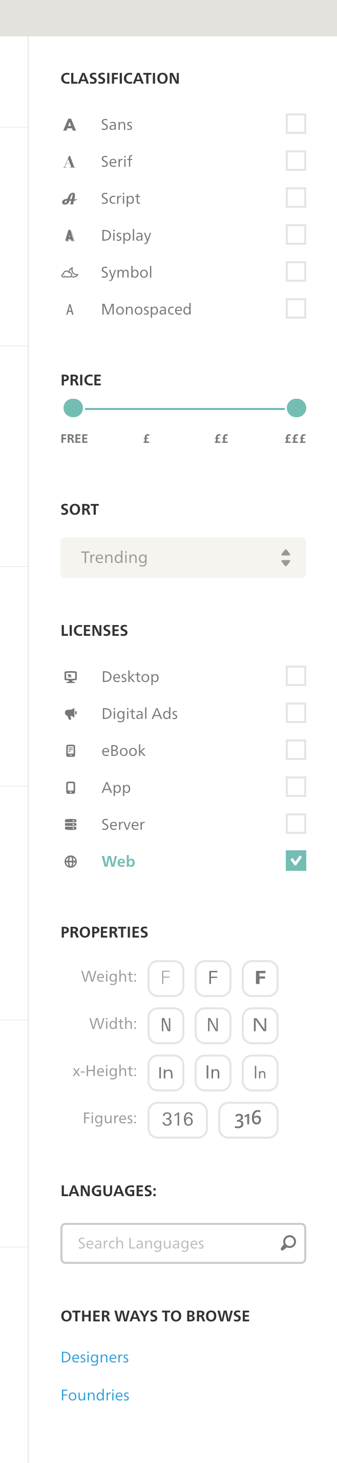
Google Fonts is the favourite of a lot of people, including me. However, before you jump to Google Fonts to look for your typefaces, I suggest you do your shortlisting on Adobe Typekit. All Google Fonts typefaces are also available on the Adobe Typekit website, but Adobe Typekit provides a better search filter. This is what the filter looks like on Adobe Typekit:
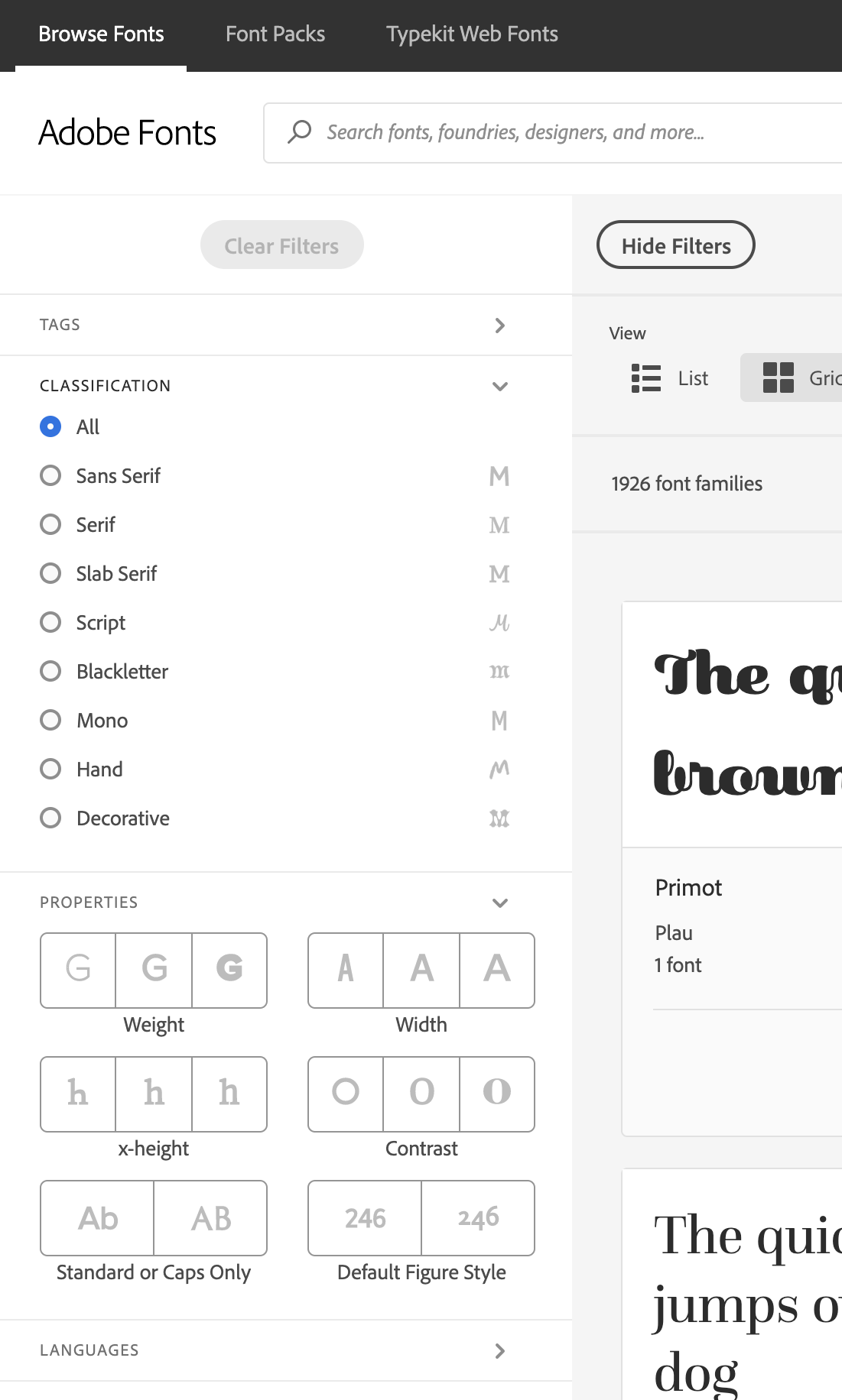
Properties like x-height and stroke contrast are all available in the filter, which makes our shortlisting process easier. A similar filter is also available on Fonts.com:
As a result, we shortlisted 3 typefaces in our primary search:
- Roboto (large x-height; low stroke contrast; free font)
- Open Sans (large x-height; medium stroke contrast; free font)
- PT Sans (large x-height; low stroke contrast; premium subscription needed)
The next step was to apply the typefaces to the prototype.
Prototyping
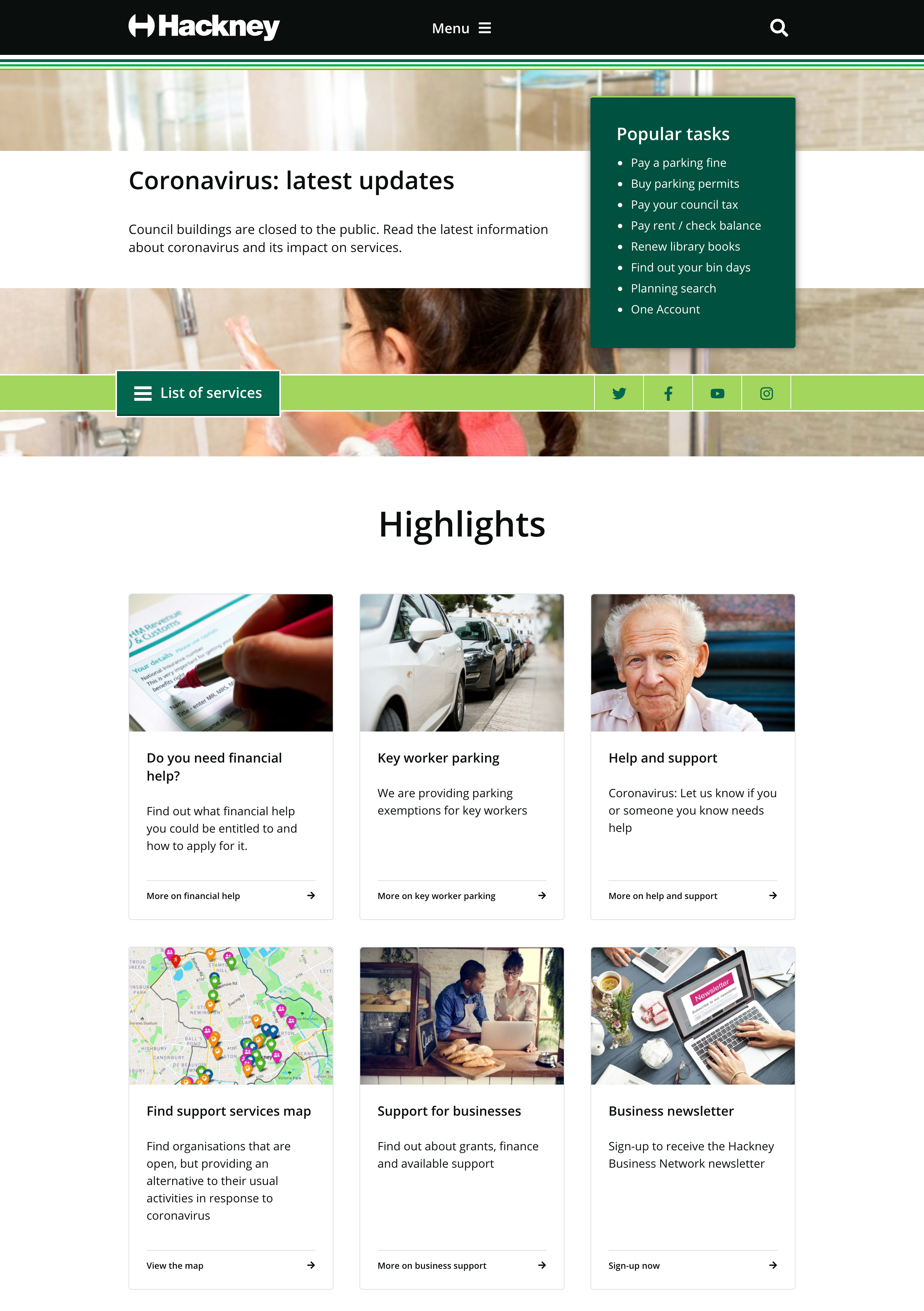
Since we asked for sample content from Hackney for prototyping purposes, all we needed to do was to download the web pages, update the CSS rules and then upload the prototype so that it could be shared with our testers. Here’s the prototype homepage we uploaded to Heroku:
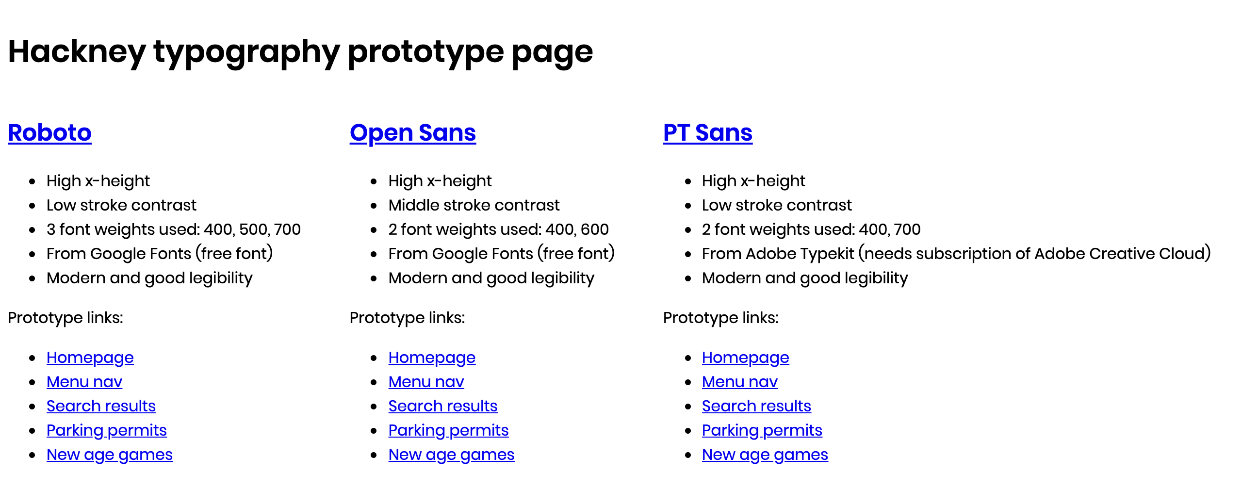
And here’s an example of how the typefaces look on the same piece of content:
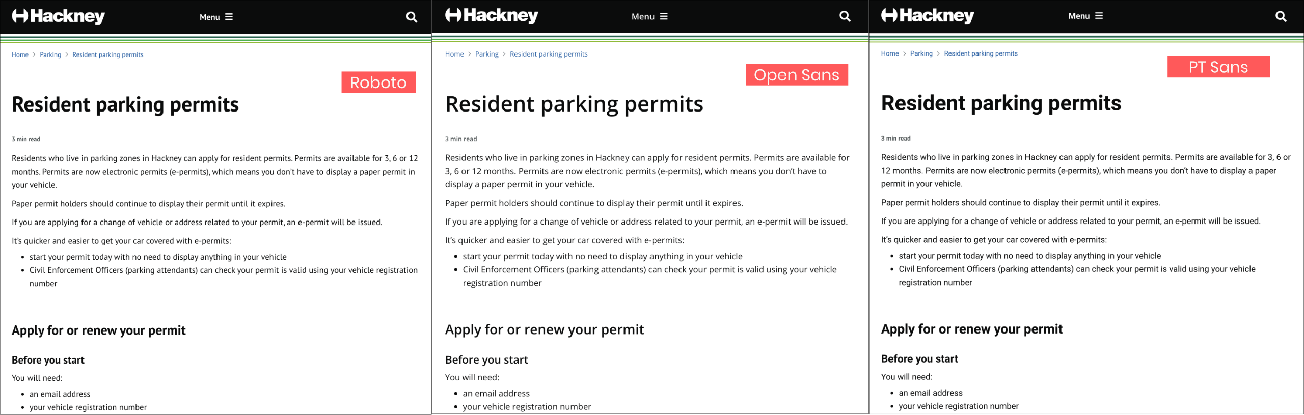
We presented the prototype to the client and although they were happy with it, they wanted to compare this with the system font Arial, which is a very safe option suggested by the GOV.UK Design System. This was a good suggestion so we iterated on the prototype by adding Arial as well as Montserrat to it.
Given all the options, my personal choice was Open Sans. I like it personally, but the legibility and the harmony between the nature of the content and the style of the typeface also stand out. Of course, things shouldn’t be decided without good evidence so we moved to the next stage – testing.
Testing
Finally, it was time to share the prototype with our users. Since it was a mini-project, instead of hiring a user researcher, Hackney ICT helped to share the prototype with internal users and stakeholders. The Service Designer designed an online questionnaire to collect feedback and we measured the results against the brief.
With limited time, we collected feedback from a handful users. The results showed some positive feedback for all the shortlisted typefaces when comparing with the original Montserrat, especially for the improvement in legibility. And between the 3 typefaces, our users found the style of Open Sans the best, followed by Roboto, and CT Sans.
Although the sample size is relatively small here, the result also showed that Arial (one of the most common system fonts) was rated as good as Open Sans. So Hackney also asked if I could provide my recommendation based on best practice. Some of my comments were:
- the high x-height of Open Sans makes it feel fresh and modern
- Open Sans has a more noticeable difference in style between various font weights
- Arial is a system font and lacks personality
- Arial can always be used as a fallback in sans serif
- Arial and Helvetica are mentioned in the Design System only as safe alternatives, and they can be too safe sometimes
Hackney were happy with our recommendations and chose Open Sans. Further iterations could have happened here but we felt they weren’t necessary in this case.
Development and deployment – day 2
After the prototyping and testing was done, I started to work together with the developer to implement the changes. The main task of the day was to replace Montserrat with Open Sans. Here’s the detail of the process:
- we applied CSS changes on the local environment
- we tested loading the font files in the staging environment
- we used Arial as the fallback. If the chosen font is a serif font then we have to pick a serif font as a fallback, and sans-serif otherwise
- If there are issues in loading web fonts, stick with FOUT (Flash of Unstyled Text). Avoid FOIT (Flash of Invisible Text) and FOFT (Flash of Faux Text)
We tested the staging site again after all those CSS changes to find out if there were any unexpected outcomes. For example, we found that the changes were not applied to the search results page in the first place. After a couple of rounds of iteration, the website was deployed in a more legible and brand new style.
There are a lot more things that can be done to improve legibility and readability by using typography skills. For example, we should pay attention to the combination of font size, line width, and line height to find out the best shape of paragraphs.
Adjusting all of these things will certainly involve a lot more work, including changes to the layout like page width. We gave Hackney our suggestions so they can work on this when they get a chance in the future.
Further reading
If you are interested in learning more about web typography, I would recommend the book Better web typography for a better web by Matej Latin.