Mapping User Research Data

In User Research we deal with a lot of data – it’s the lifeblood of our trade. We work hard to gather rich data about users, capturing it in many forms, and using a wide range of data collection techniques. But getting our hands on the data is only half the story. In order to extract its value we also need to organise, analyse and communicate it. One tool that can help with all these tasks is Google Maps. We love using it at dxw, here’s how…
Get Organised
With research data coming in thick and fast throughout each sprint, and usually in many different formats, it can be tricky to stay organised. We need to keep track of which participants we’ve engaged with, know which data came from each, and be able to find the data quickly when we need it. It’s also important that we are able to monitor the spread of the dataset to make sure that we have a representative sample from which to draw our findings. Mapping research participants and their associated data in a Google Map is an excellent way to do this.
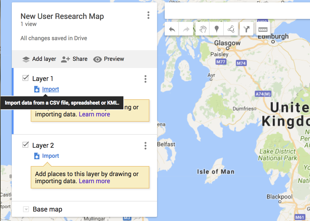
We initially capture our data in a standard tabular format that can be exported to CSV file and used to create a layer in a Google Map. Different layers can be created for different elements of the research, and toggled on/off to give different views of the data. For example we could overlay maps of survey respondents and interview participants to track multi-method research.
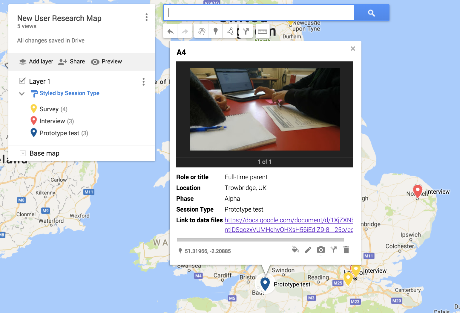
As well as a location and a reference ID, each data point can also have other data fields associated with it and displayed on the map. This makes it useful as a way of organising and navigating the data. A great tip is to populate some of the data fields with links to the raw data files stored in Google Drive. You can also attach images and videos to each data point to really bring the map to life as an interactive artefact.
Analyse your dataset
Whilst Google Maps won’t be the only tool you’ll need for analysis it can certainly help with part of the task, particularly when it comes to analysing the spread of the data and identifying geographical trends.
We can use the map to simply and easily track the quantity and make-up of our dataset. A basic example is looking at the geographical spread and making sure we are reaching users in all regions that are within scope. Different colours and icons can be assigned to each data point, and can be adjusted to reflect different data fields. This can be a really helpful and visual way to perform other analyses, for example looking at the demographics represented in our dataset. The same technique can be used to identify trends in the data, and whether they are regional – for example assigning colours to data points that correspond to specific user characteristics or findings.
Communicate and share research data
We know how important it is that research data is shared openly with the whole team and the Google Map is a great mechanism for this. The interactive map can be shared with team members and worked on collaboratively. Screenshots can also be taken to provide really clear and easy to digest graphical representations of the research.
Data is our most valuable asset as user researchers, but its value can’t be unlocked unless it’s properly organised, analysed and shared. At dxw, Google Maps is one of the tools we use to get the most out of our research data, allowing us to deliver important user insights for our clients and design great services.